For this geospatial analysis and representation of data, I selected to describe how the Joseph Webb House in Wethersfield, CT could increase the diversity of attendees to their National Historic Landmark. My map focuses on revealing some essential demographics that the museum should study if they would like more Hartford residents to visit them. For this project, my focus is helping to promote more offerings to Hartford and East Hartford residents, so towns like West Hartford, South Windsor, Newington, and Glastonbury are pushed to the peripherals and not given much attention.
I am a white man who has lived in Hartford for five years (four of which were spent living within the ivory tower of Trinity College). Over the past two-three years, COVID guidelines have become less restricted, and I have been able to patronize more restaurants, parks, and museums in the Hartford area, including the Joseph Webb House. During my quick pop-in, I noted the lack of people who were in attendance, and those who were there were elderly white people. As a student of American Studies, I have the knowledge base and critical thinking skills to uncover some potential reasons as to why this historic site has a lack of diversity among its attendees, despite being located just south of a city where the white population makes up roughly 15% of people.[1]
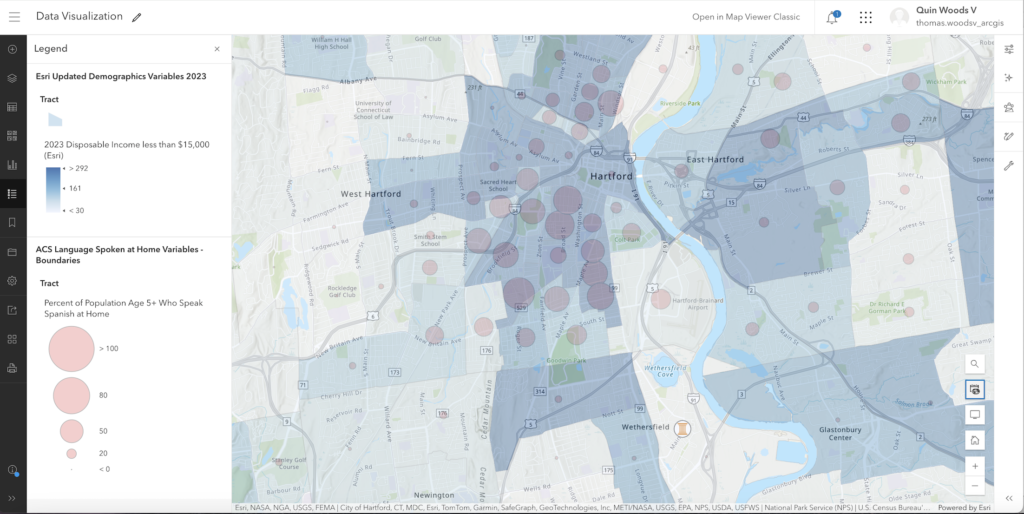
Initially, it was difficult to choose what data would be a good fit for displaying a lack of diversity at the historic site. I thought that including information about Spanish-speaking households would promote the museum to understand their proximity to different demographics than in Old Wethersfield. I decided to represent this data with red circles, where the size of the circle increases as the population density of Spanish-speaking households increases. Additionally, I chose to represent all ages (5+) as the Webb Deane Stevens Museum website claims that people of all ages should consider visiting. I also decided to present information regarding where there are communities with disposable income of less than $15,000. The districts with a darker shade of blue represent higher densities of these specific households.
It was difficult to analyze and even comprehend the data before eventually figuring out how to symbolize it and match it to a reference table. While using layers provided by the Living Atlas, it is easy to become overwhelmed by the amount of information that is stored on this platform. There are so many sub-categories that allow for a hyper-focused analysis, that I got lost in the sheer number of boxes that could be selected to be represented on the map.
My target audience for this project are members of the senior management team of the Webb Deane Stevens Museum, along with other historic sites located in close proximity to Hartford. It is important to note, however, that the Director of Visitor Engagement position within this organization is vacant, which makes me wonder what sort of changes they would like to see moving forward.[2] When thinking about presenting this data, I would not recommend printing this or sticking it on a slideshow. The information that I am presenting in this map would be better understood if users could interact with the map and click on the different districts to uncover more demographic information if they desire.
It was especially revealing to see how this museum was located within a very light blue district with a very small orange circle while also sitting right next to a district with a very dark blue shade and larger orange circle. I believe that it would have to take a full spatial analysis of Old Wethersfield, CT to fully comprehend why there is such a stark difference in demographics between these two districts, but my map serves as a starting off point to be referenced moving forward as we attempt to diversify this area.
These findings did not surprise me when I saw the differences in demographic densities between Old Wethersfield and the city of Hartford. As I travel between the South End and Old Wethersfield, I constantly note the significant decrease in traffic, change in architecture, and shift in demographics.
My understanding of geospatial analysis changed immensely after completing this assignment. I was not aware of how difficult it is to create a legible map that could be eventually presented to the community and used to change standard practices among organizations. It is incredibly easy to be critical of someone else’s work and suggest alternative methods or design choices, but now it is evident that there is an overwhelming amount of data that has been collected, and it is the presenter’s job to decipher exactly what is important to reveal to their targeted audiences.
POTENTIAL EDITS: How might I make this process memo better accessible, (I.E. edit language so that it is not obvious that I am responding to specific prompts).
Talk about the platform, experience using the platform. Not use as much academic language. (or contextualize scholarly language)
[1] U.S. Census Bureau Quick Facts: Hartford City, Connecticut, accessed April 5, 2024, https://www.census.gov/quickfacts/fact/table/hartfordcityconnecticut/PST045222.
[2] “Our Team,” Webb Deane Stevens Museum, February 29, 2024, https://wdsmuseum.org/our-team/.
Leave a Reply